2017 Pantone Colors

2017-pantone-colors

pantone-guides-design
kale-prarie-grasses-at-roaring-fork-club

pale-dogwood-floral-aspen
spring-pantone-colors-at-roaring-fork-club
http://rachelhavel.com

kale-table-scape-aspen
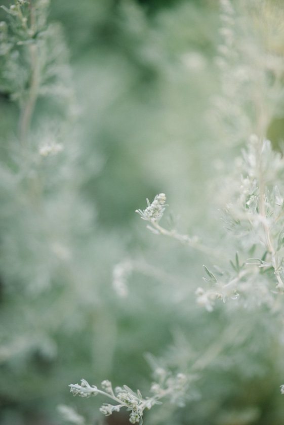
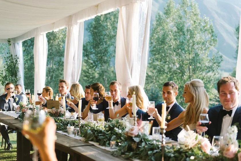
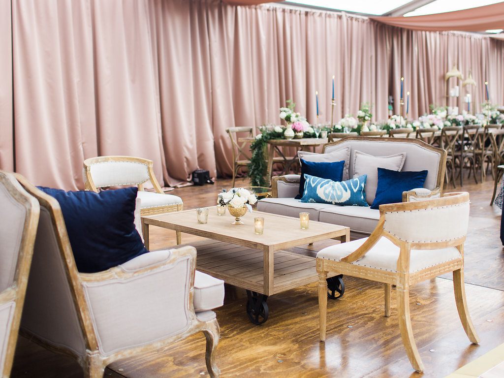
Feeling moody? A deep green paired with pale pink might be just the mood you are looking for.Pantone announced their Spring 2017 Fashion Color Report as kale and pale dogwood and we think this duo is perfect for fall.Every year Pantone declares a color "Color of the Year". Twice a year the company hosts a meeting of representatives from various nations' color standards groups. After presentations and debate, they choose a color for the following year. The results of which guide florists, fashion designers and other consumer-oriented companies to drive their designs and planning for the upcoming year.“One of the things that we saw this year, was a renewed sense of imagination in which color was appearing in context that was different than the traditional,” said Leatrice Eiseman, Executive Director of the Pantone Color Institute. “Reminiscent of the hues that surround us in nature, our Spring 2017 Fashion Color Report evokes a spectrum of emotion and feeling.”Kate Holstein PhotographyFrom the warmth of sunny days evoking dry prairies, grasses and pale dogwood and the invigorating feeling of breathing fresh mountain air with kale.Designers have applied color in playful and precise combinations to fully capture the potential, hope and transformation that we desire for each spring.It may be fall, but that doesn’t mean you can’t have some fun with a spring color tone. Though pastel colors are most commonly used for spring palettes, combining these soft colors with a deep green can transition them for fabulous fall look.There are plenty ways to incorporate pale dogwood and kale with florals and pretty table-scapes! It is up to our team of designers at Gold Leaf Event Design and Production to work hand in hand with many vendors to bring the dream to reality.Using linens which contrast stunningly with the bursts of bold florals and also with the neutral tone of the Pantone Colors. Contrast does not have to mean a crazy bold or stark difference, it can be neutral colors combined which have enough variance to make each stand out a little bit more.The details of any event are important and can really tie together and elevate a look when executed correctly. Texture layering is definitely on the list of details that can be easy to overlook but have a big impact on the overall look of a table-scape or event.